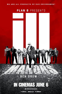
This print brief for iLL Manors is different, it has all the main characters on the front cover. Also the colours that are used aren't so typical to a normal print brief.
Furthermore, the use of the quotes from critics helps influence the audience into watching the film.
It also has star ratings on the cover to convey how good the film is to the audience.
The title is clear and bold and placed in the center for the audience to see, the quotes are also very clear ad bold.
The poster also clearly states the music is produced by Plan B which may influence the audience into watching the film and states the film was directed by Ben Drew himself.
The font is the same for everything which makes it look a bit more professional. In addition, the style of the font is in a block format, which reinforces the British-Urban genre.
The background of the poster is shown as quite dark and serious which reflects what the
film is like, we can also see an estate at the back, which emphasises the British genre.
The way the pictures are aligned makes the poster look more professional and therefore, more appealing for the audience's eye.
The synergy in this, is that there's a clear promotion of the film itself and the portrayal of Plan B's music.

This print brief is quite plain and bland, however it still contains some key information about the film. It states in bold the director of the film and the release date of the film. It also has the title of the film in the centre.
Furthermore, it has the slogan from the film "we are all products of our environment".
Unlike the other poster, it doesn't have film reviews or ratings shown. This could be a downfall as some audiences would want a rough idea of what other people think of the film. Also, if it has film reviews they could get a clearer idea of what the film is like and would may be intrigued into watching it.
Once again, like the other poster, the font is block-like which emphasises the British-Urban genre of the film.
In this poster, I don't think there is any synergy conveyed, unlike the other poster, there was the synergy of Plan B's music.

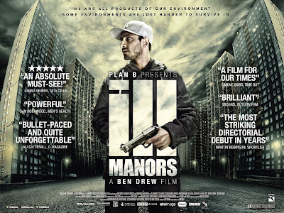
This brief as a lot going on in it, unlike the other two. It has quite a lot of film reviews which is good, as it helps give the audience a clearer idea if they want to watch the film or not. Furthermore, it has ratings which could could influence them into watching the film.
It has the main protagonist holding a gun. The background is filled with estates and it looks quite grim and dull which reflects what the film is like.
Like the previous poster the use of the slogan "we are all products of our environment" helps intrigue the audience into finding out more about the film.
The font is very similar in comparison to the other two posters, it reflects the british - urban estates, with it's block style writing. Like the others, the font is also continuous throughout, which makes it look more professional.
It also clearly states the director of the film, by both names of Plan B and Ben Drew, this may have been done to cross promote Plan B as a music artist and Ben Drew as a director.
The way the pictures are aligned makes the poster look more professional and therefore, more appealing for the audience's eye.
The synergy in this, is that there's a clear promotion of the film itself and the portrayal of Plan B's music.

This print brief is quite plain and bland, however it still contains some key information about the film. It states in bold the director of the film and the release date of the film. It also has the title of the film in the centre.
Furthermore, it has the slogan from the film "we are all products of our environment".
Unlike the other poster, it doesn't have film reviews or ratings shown. This could be a downfall as some audiences would want a rough idea of what other people think of the film. Also, if it has film reviews they could get a clearer idea of what the film is like and would may be intrigued into watching it.
Once again, like the other poster, the font is block-like which emphasises the British-Urban genre of the film.
In this poster, I don't think there is any synergy conveyed, unlike the other poster, there was the synergy of Plan B's music.

This brief as a lot going on in it, unlike the other two. It has quite a lot of film reviews which is good, as it helps give the audience a clearer idea if they want to watch the film or not. Furthermore, it has ratings which could could influence them into watching the film.
It has the main protagonist holding a gun. The background is filled with estates and it looks quite grim and dull which reflects what the film is like.
Like the previous poster the use of the slogan "we are all products of our environment" helps intrigue the audience into finding out more about the film.
The font is very similar in comparison to the other two posters, it reflects the british - urban estates, with it's block style writing. Like the others, the font is also continuous throughout, which makes it look more professional.
It also clearly states the director of the film, by both names of Plan B and Ben Drew, this may have been done to cross promote Plan B as a music artist and Ben Drew as a director.

No comments:
Post a Comment